Turnover part 2
 This map is of houses sold on these few blocks between 1999 and this year below $500K. There are still plenty of red stars representing sales. The blue are more than likely houses that sold prior to 1999, or the odd property selling at $500K and above. Since I did throw in the more than $500K on the map (not shown) it seems there were a few but not many. Comparing the map from Turnover part 1 to this one, a majority of the 1999-2009 sales were less than 1/2 a mil.
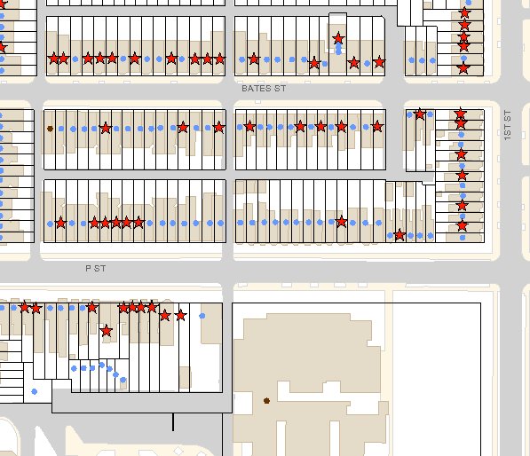
Yet the thing that I find really interesting is not so much the amount houses finally sell for, but the fact there are so many houses that change hands in a 10 year period. It seems to reflect the transient nature of DC or the investor fueled real estate boom of the 2000s.
Let's say, for the most part, that the blue dots represents long timer residents and the red stars newer residents. It isn't perfect, as the blue dots could be rentals that turn over every couple of years but never sold, and red stars rentals bought by new investors that remain rentals. On my own block one of the red stars was a rental home that the renters later bought from the owner. But anyway let's say those red stars represent new blood on the block, in some spots, except that part of the 100 block of P, there is a fair amount of turnover.
If you get on the DC gov website and play with the DC Atlas for Real Property and compare and contrast with other parts of the city regarding final sale prices (which sometimes isn't the listing price) and turn over, it's interesting.
Labels: data/demographics, gentrification
posted by Mari @ 18.11.09
![]()
![]()


0 Comments:
Post a Comment
Links to this post:
Create a Link
<< Home